

HTML5 is knocking around for some time already. Actually, most of it was widely adopted, fairly quickly became a part of good practices, and later — almost mandatory for semantic and structured Web content. In general, it allows to specify more than one version of the image to be shown, and let the browser choose option that fits most.
Almost every conscious web developer is aware of <picture> tag and knows that it solves a problem with responsive, optimized images in Web. While it may seem no-brainer, knowing exactly how that works and how browsers handle that is sometimes being treated as kinda’ witchcraft.
In good ol’ days of the Internet, everyone was browsing the Web with Internet Explorer (or earlier, Netscape Navigator), using desktop with screen having more-or-less the same resolution. However, starting from 1990s, more and more different resolutions appeared, and another types of devices got connected to the Internet, having now almost everything online. PCs. Smartphones. Tablets. Game consoles. TVs. Smartwatches. Even light bulbs (OK, I know — even if connected to the Internet, one can not browse the Web with light bulb. Yet.) All these devices coming with dozens of different models, combinations, screen sizes and resolutions. To make this hell worse, Apple introduced Retina displays a while ago. There is no longer possibility to have one-picture-to-rule-them-all. Kinda dark times for people trying to publish content in the Internet, right? Well, not really.
Controlling image dimensions: srcSet
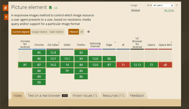
It’s been some time when the <picture> was introduced, and as you see above, it is supported by all Internet browsers (I mean, browsers). Internet Explorer has some polyfills available, so if you still have to support this
ancient artifact, there is an option. At worst, without polyfill, it would be fallbacked to what was defined in <img> tag.
First, let’s assume that we have image that takes full width of the article pane, up to 1000px. Wanting them to be shown good on Retina screens, we might do something like the following:
<picture>
    <source srcset="1000px.jpg 1x, 2000px.jpg 2x, 3000px 3x" />
    <img src="1000px.jpg" alt="Our beautiful image" />
</picture>
Adding a <source> element with srcset attribute, containing comma-separated list of URLs to different versions of the image, will instruct the browser to choose the one that fits best. In this case, for devices with device pixel ratio equal to 2, bigger image could be loaded. For device pixel ratio at 3, the biggest one will be loaded, making everything look fine on different screens.
However, this takes into consideration only pixel density — so, even browsing with the small Retina-like device will trigger loading bigger image unnecesarily. For example, with iPhone 6/7/8, working at CSS resolution of 375x667 and pixel density 2.0, we can take advantage of image being at most 750 pixels wide. The smallest one provided is sufficient, while device pixel ratio suggest to load image with dimensions multiplied by 2. Definitely not the best way to save bandwith. If we would want to do it better, we need to make calculations based on image placeholder size & breakpoints, and use media querying to adjust <source> elements accordingly. Additionally, we’re not optimally covering devices with pixel density values not being integer, or bigger than three (there are already some devices).
That’s why second option of providing image size alternatives — width descriptor — is much more fancy. Instead of constraining images to pixel density, let’s just describe the images we’re providing:
<source srcset="1000px.jpg 1000w, 2000px.jpg 2000w, 3000px.jpg 3000w" />The above literally instructs browser that 1000px.jpg is 1000 pixels wide, 2000px.jpg — 2000 pixels, and 3000px.jpg — 3000 pixels.
Why is that better? We didn’t instruct the browser directly when certain images should be picked, but just let it to browser. We still need to give browser directions on how to choose it, but we won’t need to tie image sizes with media conditions, doing all the calculations and constraining loading proper images. Just imagine the scenario of whole-width-images-but-2-columns-on-tablet-and-4-on-desktop, and try to include all variety of pixel density. Yup. May by a bit messy. And let the one of you that won’t make a mistake during the calculations be the first to cast a stone.
OK, we did first part — told the browser what images we have. Now let’s add sizes to that. To make things more fun, let’s use that simple layout mentioned earlier:
- on mobile, image is displayed full width
- on tablets, show items in two column layout
- 4 columns for desktop,
- whole content pane is growing up to 1400px at screen width of 1440px, then leaving margins on both sides.

While it might seem tough, actual markup is pretty straightforward:
<source srcset="340px.jpg 340w,
                480px.jpg 480w,
                700px.jpg 700w,
                1024px.jpg 1024w"
        sizes="(min-width: 1440px) 340px,
               (min-width: 1024px) 22vw,
               (min-width: 768px) 45vw,
               92vw"
                />
We can see already known srcset, and a new attribute — sizes. Sizes describe widths of space held for the image, in CSS units. Note that w in srcset mean “pixels of image”, while px in sizes — “CSS pixels” (which not necessarily mean screen pixel).
Why is that better? Well, what we did was describing images we have (in image units), as well as space which these image should occupy (in CSS units), leaving all the calculations to browser. We don’t have to bother device pixel ratio, counting what should the image size be and so on. Additionally, we described both images and space for them in their natural units — image in pixels (of bitmap), sizes — with CSS px or vw, the units we use in CSS to same exact thing. So now, viewing the page with Retina iPhone with resolution (in CSS pixels) 375x667, with device pixel ratio equal to two, browser will look for image 690 pixels wide (375 * 0.92 * 2). The closest one is 700, so this one will be chosen.
What’s also worth noting:
- if multiple media conditions are met, first (top) matching size is taken — this might be a bit counterintuitive, as with CSS, selectors weighted equally are applied sequentially
- despite above example uses
pxorvw, you can use any CSS unit (vh,em,rem), or evencalc. I prefer to simplify things so usually go with simple approximation that is fair enough, but value accurately calculated withcalcwill also do the job. However, percents cannot be used.
Alternative images for different views (aka art direction-based selection): <source> and media
While srcset and sizes address our needs for different image quality across screens, it doesn’t help when our layout changes significantly across devices. Let’s suppose we have nice, beautifully composed, horizontal product photo, that shows your product with great surrounding on desktop. However, with the same photo on vertical, 4-inch smartphone screen, customer will barely see the product. We need to show something more accurate.
To achieve this, just create separate <source> element with media attribute describing when to use each image:
<picture>
    <source media="(min-width: 1024px)"
            srcset="nicely-composed-medium.jpg 1024w,
                    nicely-composed-large.jpg 1440w"
            sizes="100vw"/>
    <source srcset="bare-product.jpg 375w,
                    bare-product-retina.jpg 750w"
            sizes="100vw"/>
    <img src="default.jpg" alt="My beautiful product" />
</picture>
While this might seem a bit similar to use of srcset and sizes, the main difference is that by using different <source> you instruct the browser that another image is used, and it’s not only another sizing of the same — so, for example, resizing the screen down will force loading the new image if another <source> meets its criteria. This wouldn’t happen with srcset, as browser won’t load smaller image already having bigger version of the same pic.
Different image formats
Another nice feature of <source> is possibility to serve images in different formats. For example, if we want to allow using webp images for browsers supporting it, just add type=webp attribute:
<picture>
    <source srcset="image.webp" type="webp" />
    <source srcset="image.jpg" type="jpeg" />

    <img src="default.jpg" alt="Alternate text" />
</picture>
Guess that’s rather self-explanatory, so no need to explain.
That’s it!
With <picture> tag, responsive, adaptive images are becoming ridiculously simple, especially combined with solutions that can do the job of resizing and/or cropping automatic. It is supported virtually everywhere, and it’s worth to be used in nearly every web page.
Using Optimizely CMS (formerly EPiServer)? The solution already exists.
Images:
1: Pine Watt
2: Pixabay
3: Tom Swinnen
3: Mali Maeder
5: caniuse.com