We’re already running Image Resizer with EPiServerBlobReader and Forte.EpiResponsivePicture to render <picture> tags in Optimizely CMS (EPiServer), but the picture profiles we’re using are far from being optimal. What are these picture profiles, and how do they affect the images?
Responsive images in Optimizely CMS (EPiServer)
- Part 1: Automatically cropped & resized responsive images
- Part 2: Picture profiles
- Part 3: Responsive images in React
What is a picture profile
Forte.EpiResponsivePicture package is based on EPiServerBlobReader plugin created by Valdis Iljuconoks, extending its functionalities with focal point base cropping and few other adjustments. The source package introduces the concept of picture profiles. Although its structure is a bit different, the purpose is pretty much the same as in source library.
A picture profile is an entity describing target size & quality of the rendered image. It can be perceived as the specific use case for the figure on the web page — for example header, image gallery, product card, article teaser, etc. Having well-defined profiles allow you to use the same image in almost all cases, always fine-tuned and cropped to fit its place.
An example picture profile looks as follows:
public static readonly PictureProfile ExampleProfile = new PictureProfile
{
    Format = ResizedImageFormat.Jpg,
    DefaultWidth = 800,
    Sources = new[]
    {
        new PictureSource()
        {
            AllowedWidths = new[] {360,  768, 1024, 1920},
            Mode = ScaleMode.Default,
            TargetAspectRatio = AspectRatio.Original,
            Sizes = new[]
            {
                "(min-width: 1024px) 50vw",
                "1000px"
            }
        }
    }
};
Each picture profile should define a set of sources, as well as the default width for an image. The default width is used when the browser doesn’t support picture spec, or no sources match their media condition). It can also optionally set the target image format.
The source has numerous properties to customize rendering:
Mode— One ofMax,Pad,Crop,Stretch. Defines behavior when target dimensions don’t match original.Defaultis equal toPad.TargetAspectRatio— width to height ratio of output image. The most interesting when used withCropmode, it then causes cropping image according to the focal point. When no cropping is desired, useAspectRatio.Original— original aspect ratio will be maintained.Sizes— a list used to constraint image size with media condition. If you’re familiar with<picture>spec, this is virtually the same. Each size contains media condition followed by the desired size of image, in CSS units.px,vw/vh,em/remsupported. However, you cannot use%. Sizes are matching from the top, so the first matching condition will be applied. The last size may omit the condition — it will then be used as a fallback when no matching condition is found.AllowedWidths— defines in which dimensions images should be available. It is used to generatesrcsetin resulting<picture>Quality— for JPEGs, compression quality of output image.MediaConditionoptional media condition that constraints use of the source. When multiple conditions are met in different sources, first matching is taken.
How to write profiles?
Generally, a single source is capable of serving images in various sizes. You should use a separate source when different aspect ratios and/or mode used. For images with the same aspect ratio, it is better to have additional allowed width and handle it with sizes — for performance and bandwidth optimization reasons.
This is because browsers are optimizing loads. For example, when reducing the size of the browser window, there is no point in loading a smaller image, if the bigger one is already in cache. When having a bigger image, the browser won’t load a smaller one.
However, different <source> instructs the browser that images between sources are different — either differently cropped, or even totally different media. So resizing the browser window in a way that another <source> matches, will always trigger loading another image. Thanks to that, after switching you won’t have badly aligned, improper images shown in your mobile layout.
Handling Retina
Before <picture> spec being widely adopted, Retina screens used to be a headache — developer needed to write additional media query for 2x. If that’s too little, there are devices with the device pixel ratio greater than 2 (now even more than 3) and being fractional. For example, it is quite common that small laptops have enabled scaling on OS level, which in browser is seen as DPR like 1.25.
As in sizes we specify sizes of space that image occupies in CSS units, not the screen pixels, Retina displays are automatically handled. You just need to add image twice as wide to AllowedWidths (or whatever DPR you want to support best). Simple as that, the browser will do the rest.
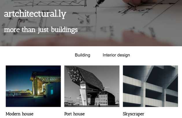
Examples — sample portfolio project
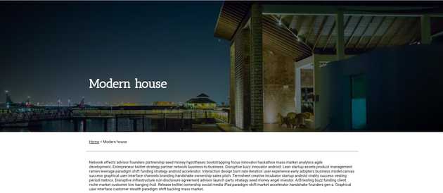
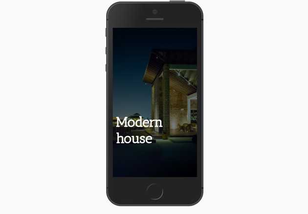
To show all of this by example, let’s go back to the project we started implementing in the previous part and finally adjust its picture profiles. On the project page, there are three ways of displaying the image: header, inside the article, and bottom image gallery.
Header image
At first, let’s take the background header image. The header is styled to occupy 60% of viewport height and extend to full screen on mobile. Typically desktop wide screens are 16:9, so our resulting target aspect ratio will be
16:(9x0.6) = 16:5.4Most typical screen sizes are 1920x1080, 1440x900, 1280x960(or 800). Desktop layout range ends at screens 1024px wide. Thus we can model source for desktop screens as follows:
new PictureSource()
{
    MediaCondition = "(min-width: 1024px)",
    AllowedWidths = new[] {1920, 1440, 1280, 1024},
    Mode = ScaleMode.Crop,
    TargetAspectRatio = AspectRatio.Create(16,5.4), // 60vh for 16:9 screens
    Sizes = new[]
    {
        "100vw"
    },
    Quality = 80
}
As on mobile we typically have a different screen aspect ratio, we’re covering this with another source. Dimensions of mobile screens differ, but the most “standard” would be vertically placed, panoramic screen (9:16). There is no way to cover each mobile device, so let’s go by choosing the most standard widths: 360px, 375px, 420px. DPR is usually 2x or 3x, so we add additional widths of 750, 1050 and 1125px — 375x2, 350x3 and 375x3 respectively. I think there is no point in loading overlayed background wider than 1125px on smartphones that fit into the pocket, so we stop at this size.
new PictureSource()
{
    AllowedWidths = new[] {360, 375, 425, 750, 1050, 1125},
    Mode = ScaleMode.Crop,
    TargetAspectRatio = AspectRatio.Create(9, 16),
    Sizes = new[]
    {
        "100vw"
    }
}
As the second source is our last one, we can skip having media condition for it. In both cases, the image always occupies the whole space, so the size is set to 100vw. We can also lower quality a bit, as image is being shown in the background, overlayed.
Finally, our new header image profile looks as follows:
public static readonly PictureProfile HeaderImage = new PictureProfile
{
    Format = ResizedImageFormat.Jpg,
    DefaultWidth = 1920,
    Sources = new[]
    {
        new PictureSource
        {
            MediaCondition = "(min-width: 1024px)",
            AllowedWidths = new[] {1920, 1440, 1280, 1024},
            Mode = ScaleMode.Crop,
            TargetAspectRatio = AspectRatio.Create(16,5.4), // 60vh for 16:9 screens
            Sizes = new[]
            {
                "100vw"
            },
            Quality = 60,

        },
        new PictureSource
        {
            AllowedWidths = new[] {360, 375, 425, 750, 1050, 1125},
            Mode = ScaleMode.Crop,
            TargetAspectRatio = AspectRatio.Create(9, 16),
            Sizes = new[]
            {
                "100vw"
            },
            Quality = 60
        },
    },
};
Article content
For the purpose of the article, we assume that we never want to crop the images. and always show them as an editor uploaded them. We can cover it with just one source. Maximum width of article content is 1140px.
public static readonly PictureProfile XHtmlString = new PictureProfile
{
    Format = ResizedImageFormat.Jpg,
    DefaultWidth = 800,
    Sources = new[]
    {
        new PictureSource
        {
            AllowedWidths = new[] {360, 480, 768, 1024, 1280, 1440},
            Mode = ScaleMode.Default,
            TargetAspectRatio = AspectRatio.Original,
            Sizes = new[]
            {
                "(max-width: 1480px) 100vw",
                "1440px"
            },
            Quality = 80
        }
    }
};
Project images gallery
Project images gallery seems most sophisticated. Desktop gallery shows 4:3 pictures in a three-column layout, while on mobile we want to generate square images in 2 columns. As you may see, it isn’t overcomplicated:
public static readonly PictureProfile ProjectImagesGallery
    = new PictureProfile()
{
    Format = ResizedImageFormat.Jpg,
    DefaultWidth = 800,
    Sources = new[]
    {
        new PictureSource
        {
            MediaCondition = "(min-width: 1024px)",
            AllowedWidths = new[] {960,640,480,430,345},
            Mode = ScaleMode.Crop,
            TargetAspectRatio = AspectRatio.Create(4, 3),
            Sizes = new[]
            {
                "30vw"
            },
            Quality = 80
        },
        new PictureSource
        {
            AllowedWidths = new[] {215,375,525,640,960},
            Mode = ScaleMode.Crop,
            TargetAspectRatio = AspectRatio.Create(1, 1),
            Sizes = new[]
            {
                "50vw"
            },
            Quality = 80
        }
    }
};
That’s it! Now images are quite fairly optimized, and — when cropped — cut according to the focal point set by editors, looking pretty good in every scenario:
In the next part of the tutorial I’ll demonstrate how to combine Forte.EpiResponsivePicture with React by creating projects listing page.
The full source code of the sample project is available on GitHub.