Responsive images in Optimizely CMS (EPiServer)
- Part 1: Automatically cropped & resized responsive images
- Part 2: Picture profiles
- Part 3: Responsive images in React
As responsive websites must load quickly and offer good quality on all devices at the same time, it is almost obligatory to use HTML5 <picture> tag that allows providing different sets of images targeting a whole variety of screen sizes and pixel densities. In this series I’m showing how to make automatic, responsive pictures in Optimizely CMS (formerly EPiServer), which gets automatically scaled, compressed, or even cropped perfectly for the use case.
The <picture> tag is handy, but preparing each image in at least a few sizes is not the most attractive action that content creators can do. Additionally, computers are times better and faster in image processing (additionally, they don’t get bored at the same time) — so there is no reason to do that by ourselves.
What is Forte.EpiResponsivePicture
Valdis Iljuconoks had created great EPiServer plugin that allows automatic resizing of the images. It enables ImageResizer support for the content uploaded to the CMS. I also liked focal point-based cropping shown in the project developed by defsteph (currently archived), but neither of these two projects allowed fully adjusting image size or cropping based on visitor’s screen size.
Leveraging concept of picture profiles from Valdis’ package by mixing it with focal point cropping and ImagePointEditor by ErikHen had allowed to squeeze from the <picture> spec as much as possible!

Focal point
On one hand, we could allow editors to upload different images for all variants of layouts, but in reality, we usually don’t need completely different images for desktop and phone/tablet screens. In the vast majority of cases, all we want to do is just make the image cropped in a way that the most important part of the image is still shown. This part of the image is called its focal point. By allowing editors to choose that place on the image, we will be able to use the same image in very different scenarios, automatically cropped, and looking good at the same time on every device and use case on your page. No one likes boring, repetitive tasks, so if you take them off the editors, they’ll be really grateful!
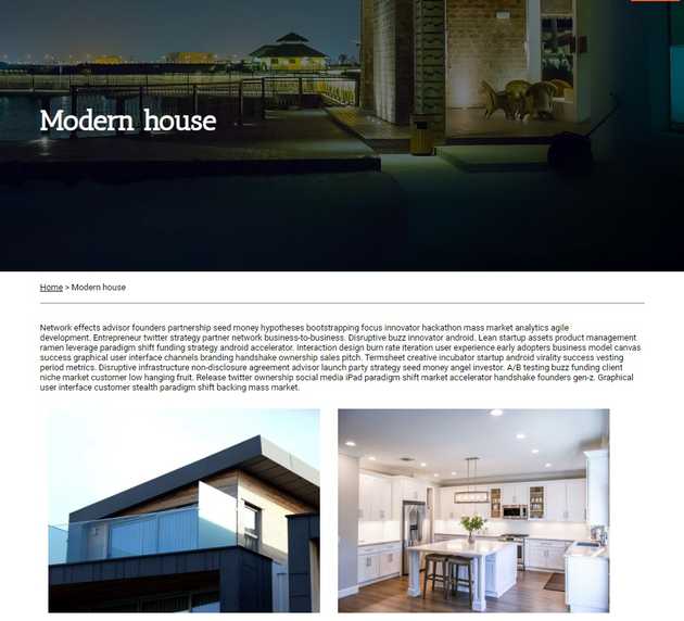
Let’s take an example project to illustrate the idea — a site presenting the portfolio of fictional architects. We’re starting with a simple page that describes a project:
How to use
Disclaimer: The code shown in this article is meant to illustrate the idea and usage of the
Forte.EpiResponsivePicturepackage and is not showing good practices of writing code. For the simplicity of this tutorial, some things are deliberately trivialized.Full code of the project developed in this tutorial can be found on GitHub.
Installation
First, let’s install the package from NuGet feed from your IDE, or by running the command:
Install-Package Forte.EpiResponsivePictureWarning: When installing via JetBrains Rider, make sure that static resources of peer dependency, ImagePointEditor, located in
modules/_protected/ImagePointEditor, were added to the project correctly as<Content>, not<None>(see picture below).
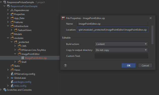
Image content type & properties
Then, let’s create content type for an image, deriving from base image type in Forte.EpiResponsivePicture:
[ContentType(GUID = "FD23C075-1DCD-4EF9-9E60-505ACD34C211")]
[MediaDescriptor(ExtensionString = "jpg,jpeg,gif,png")]
public class Image : Forte.EpiResponsivePicture.ResizedImage.ImageBase
{
}
When introducing responsive pictures to an existing project and you can’t, or simply don’t want to derive from the base class, alternatively you can implement IImage and IResponsiveImage interfaces, for automatic alt loading from image metadata, and focal point based cropping, respectively. Width and Height properties are automatically set when publishing content, so they shouldn’t be editable. Although, base class has also the additional quality of being culture-specific, so you can prepare versions of alt for different language branches easily (this is greatly explained by Greg Wiecheć on his blog).
Responsive image as property on page
Our first page type will represent single project in portfolio of our architects:
[ContentType(GUID = "4CCD0094-450D-449F-8B51-D7FF7A5A249F",
             DisplayName = "Project Page",
        Description = "Single project article")]
[AvailableContentTypes(Availability.None)]
public class ProjectPage : PageData
{
    [Display(Order = 0)]
    public virtual string Title { get; set; }

    [Display(Order = 10)]
    [UIHint(UIHint.Image)]
    public virtual ContentReference MainImage { get; set; }

    [Display(Order = 20)]
    public virtual XhtmlString Description { get; set; }

    [Display(Order = 30)]
    [AllowedTypes(typeof(Image.Image))]
    public virtual ContentArea Images { get; set; }
}
This page allows adding images in three different ways
- as a
ContentReferencein MainImage, - as elements of
ContentArea, forImagesgallery, - in Description, added to
XhtmlStringvia TinyMCE.
To render <picture> from content reference, we call ResizedPicture(ContentReference, PictureProfile) extension method of HtmlHelper:
<article>
    <div class="header">
        <div class="content">
            <h1>
                @Html.PropertyFor(m => m.Title)
            </h1>
        </div>
        @Html.ResizedPicture(Model.MainImage,
            PictureProfiles.HeaderImage) <!-- rendering of the image -->
    </div>
    <div class="content description">
        @Html.PropertyFor(m=>m.Description)
    </div>
</article>
The second parameter of the ResizedPicture method is an instance of Picture Profile. PictureProfile is a class that represents single use case of an image, describing image dimensions, cropping, quality, etc. needed for that place, allowing to instruct the browser how the images should look like. These data are not related to the images themselves, rather describing a concrete place on a website for it. I’ll explain this concept, as well as how to create picture profiles, later. For now, let’s go with some placeholder:
public static class PictureProfiles
{
    public static readonly PictureProfile HeaderImage = new PictureProfile()
    {
        Format = ResizedImageFormat.Jpg,
        DefaultWidth = 800,
        Sources = new []
        {
            new PictureSource
                {
                    AllowedWidths = new[] {1920, 1440, 1280, 1024},
                    Mode = ScaleMode.Crop,
                    // 60vh for 16:9
                    TargetAspectRatio = AspectRatio.Create(16,5.4),
                    Sizes = new[]
                    {
                        "100vw"
                    },
                    Quality = 60
                },
        }
    };
}
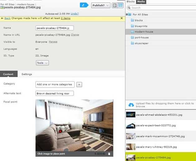
Now we can run the application, go to CMS edit mode, and create a new page for the project. Upload an image, remembering about filling alternate text and setting focal point, being the most important thing the photo is showing. Then, if we set the image as HeaderImage of our hero page, we can see that our image was rendered nicely as a <picture> element, and is adapting to screen dimensions changes. Also, alternate text was loaded from image properties in the proper language.

However, as we didn’t use @Html.PropertyFor, On-Page Editing doesn’t work for this property. To address that issue, we need to define a display template for properties marked with Image UiHint (for more info, Allan Thraen wrote a great post explaining how images are rendered in EPiServer (now Optimizely)). Let’s create a partial view in Views/Shared/DisplayTemplates, named Image.cshtml with model matching to our property type, that additionally tries to extract Picture Profile from ViewData:
@model EPiServer.Core.ContentReference
@{
    var pictureProfile = (ViewData["PictureProfile"] as PictureProfile)
        ?? PictureProfiles.XHtmlString;
}

@if (ContentReference.IsNullOrEmpty(Model) == false)
{
    @Html.ResizedPicture(Model, pictureProfile)
}
Now we can render the image with .PropertyFor passing picture profile as additional view data. Let’s wrap this call with a handy extension method:
public static class HtmlHelperExtensions
{
    public static MvcHtmlString ImagePropertyFor<T, TValue>(this HtmlHelper<T> html,
        Expression<Func<T, TValue>> propExpr,
        PictureProfile pictureProfile)
    {
        return html.PropertyFor(propExpr,
            new {PictureProfile = pictureProfile});
    }
}
Now, after rendering the image with the following line, On-Page Editing works properly:
@Html.ImagePropertyFor(m=>m.MainImage, PictureProfiles.HeaderImage)Rendering <picture> for Image in Content Area
Our project page looks great already. However, after adding some pictures in TinyMCE to the XHtml description field, it is still rendered as a regular <img> tag. Moreover, after adding some nice pictures to the Images Content Area, the page breaks completely, not knowing how to render the images! Let’s address the second issue first.
Let’s create a partial controller for our image type to make Optimizely (EPiServer) know how to render this type of content — exactly the same as we’d do with any content that can be rendered in the Content Area. The controller attempts to extract picture profile from ViewData of parent context. When profile is not present, it falls back to default XHtmlString profile — passing the data to Image.cshtml view defined in the previous step:
[TemplateDescriptor(
    Inherited = true,
    Default = true,
    AvailableWithoutTag = true
)]
public class ImageController : PartialContentController<Image>
{
    public override ActionResult Index(Image currentContent)
    {
        var profile = ControllerContext.ParentActionViewContext
                         .ViewData["PictureProfile"] as PictureProfile
                        ?? PictureProfiles.XHtmlString;

        ViewData["PictureProfile"] = profile;

        return PartialView("~/Features/Image/Image.cshtml", currentContent.ContentLink);
    }
}
We still need to define XHtmlString picture profile:
public static readonly PictureProfile XHtmlString = new PictureProfile()
{
    Format = ResizedImageFormat.Jpg,
    DefaultWidth = 800,
    Sources = new []
    {
        new PictureSource()
        {
            MediaCondition = "max-width: 768px",
            AllowedWidths = new [] {360, 480, 768},
            Mode = ScaleMode.Crop,
            TargetAspectRatio = AspectRatio.Create(3,4),
            Sizes = new []
            {
                "95vw"
            }
        }
    }
};
Now in ProjectPage.cshtml we can finally render the content area containing images, passing specific profile in the additionalViewData parameter (let’s not bother the picture profile for now, we can use any of the existing as well):
@Html.PropertyFor(m=>m.Images,
    new
    {
        PictureProfile = PictureProfiles.HeaderImage
    })

Picture in XHtmlString
The next thing that we still need to have worked out is rendering images dropped to the XHtmlField, edited via TinyMCE. By default, TinyMCE adds image dragged in the editor as <img>, allowing an editor to add custom classes and customize rendering. There are generally two ways of coping with that:
- customize TinyMCE to add an image as a content block,
- alter rendering process of XHtml fields and replace
<img>tags with responsive<picture>element.
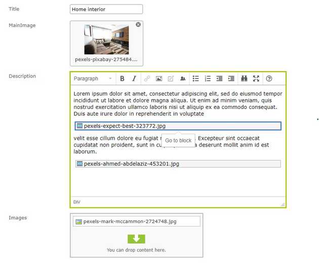
As the first solution is neat and simple, we’ll go with that one. We only need to add a custom UI Descriptor, altering drop behavior for Image content type:
[UIDescriptorRegistration]
public class ImageUIDescriptor : UIDescriptor<Image>, IEditorDropBehavior
{
    public EditorDropBehavior EditorDropBehaviour { get; set; }

    public ImageUIDescriptor()
    {
        EditorDropBehaviour = EditorDropBehavior.CreateContentBlock;
    }
}
When dropped, the image will be now rendered with partial controller and the view defined for Content Area. It is worth knowing that using “Insert/edit image” won’t result in the same, so we have to remove this button from toolbar to prevent users from something we don’t expect.
That’s it! We have made our responsive images work with the Optimizely CMS. The next part will show how to replace current placeholder picture profiles with the actual ones.
The whole source code of this tutorial can be found on GitHub.
Images:
1: Karolina Grabowska
2: SplitShire
